
Creating Useful Dashboards: Part 1 - Building the Foundation
By Elise Bajohr, CPHQ
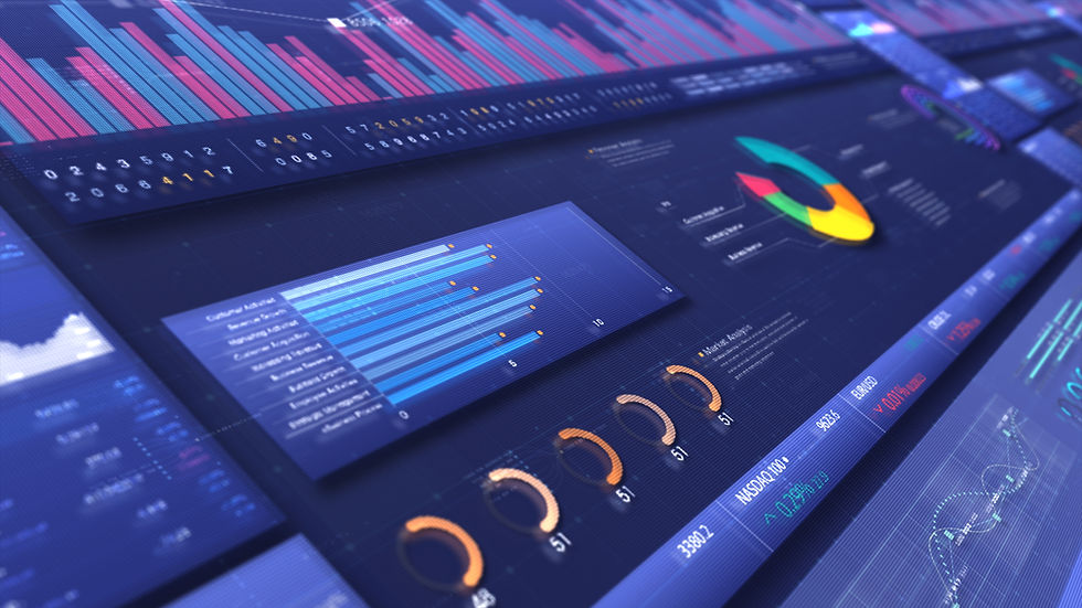
Do you prefer seeing a chart as opposed to reading a table of numbers? If so, you are amongst the strong majority of individuals. Dashboards present data in user-friendly ways to help non-profits make data-informed decisions, demonstrate transparency for donors, and provide many other key benefits. However, not all data visualizations are created equal, and not all dashboards are actually used by their intended audience. If these statements resonate, this article is for you.
Welcome to a two-part series about creating useful dashboards for non-profit business development and continuous quality improvement. This article guides you through the foundational steps for building a meaningful dashboard. The second article will describe the tips for cleaning data, data visualizations, and going-live. Let’s start by discussing building a business case through productive discussion.
Building Your Foundation, Before Opening A Dashboard Program
One of the very first questions to ask is, “What are we trying to solve?” Dashboards are instrumental in monitoring, development, forecasting, continuous quality improvement, and project management (to name a few), but before you begin pulling together data sets and determining which visualizations to use, determine the purpose of the dashboard. Leadership can fall into a trap of ordering dashboards as a panacea and data analysts can get mired in the quicksand of running with that order and creating what they think is best. The result? A dashboard that doesn’t actually answer the fundamental questions and ends up being pretty, impressive, but ultimately not useful.
After falling into the traps of leadership and data analysts in my career, I have developed tried and true steps to solidify the business case needed to create a meaningful dashboard. Whether you are the person requesting the dashboard or the person building it, a simple, exploratory conversation, or two, is key for smooth and efficient execution.
Questions to guide your conversation are detailed below.
Who will use this dashboard?
Determining the audience is critical for creating a dashboard. For example, if a dashboard is going to be used by multiple levels of an organization, you might consider multiple tabs or multiple dashboards. A board of directors typically prefers a higher-level view of information such as business development, financial forecasting, and program connections to the mission, vision, and values. A project team might monitor their progress and stay on track with tasks and action items. Management and directors may track deliverables, demographics, outcomes, and outputs for continuous improvement efforts and seamless reporting. Direct service staff can manage cases and tasks, understand their budgets, and have productive discussions with their supervisors.
What is important to them?
Determining priorities and overall focus is helpful for setting the tone of the dashboard. This can be asked at the beginning of a conversation to get the thoughts and ideas flowing, or it can be an ending question, to capture any ideas that were generated through the conversation. This question demonstrates why a conversation is important, it is harder to “read the room” and organically build on ideas in an email chain.
If you are the dashboard designer: Ask open-ended questions and use active listening to explore the ideas generated. Open-ended questions generate more creative ideas than leading or yes/no questions. Use this time to ascertain what the group might want to see but not know how to directly articulate. Learn what the audiences care about. This can include asking about program objectives, missions, deliverables, goals, scenarios, and problems.
If you are requesting the dashboard or representing the audience: Articulate a step beyond an elevator speech. This provides a frame to the picture that the dashboard designer will create. Think about the mission of the organization and the program/project. Consider the KPIs and what the audience cares most about.
What do you want the dashboard to tell you?
Dashboards and data visualizations can serve a variety of functions. This is where you hone into the request. Consider whether the dashboard should demonstrate value, effort, finances, progress towards goals. Do you want to monitor data for trends and/or continuous improvement efforts? Do you want it to help manage a project? Usually there is a specific purpose, this is the time to nail down the key components that the dashboard should have.
Are there other people I should talk to before creating the first draft?
There are times when the person requesting the dashboard has other stakeholders for you to talk to, and there are times when they want you to get started as is. Every situation and dashboard is different and there is no default better or worse option. Ensuring you have enough understanding about what the data should show is the real key, but directly asking this question is helpful to ensure you do not miss an important foundational piece.
Who has the information (data) needed for the dashboard?
This is a critical question for getting started. We will talk more about cleaning data in the next article, but getting access to the data sources is key. Of note is using the word “information” instead of “data.” This might seem like semantics but it’s a tip from lessons learned over time. Some people balk at the word “data,” and look at you like a deer in the headlights. However, when you ask them how they track their progress, clients, services, budgets, etc., those same eyes light up. Some organizations have tech systems that present what you need cleanly and clearly, but many nonprofits use excel sheets or shared drives and do not think of it as “data.” Having this conversation is key for these scenarios, because people often have more “data” than they think, and as obvious as it seems to a data analyst, discussing this is sometimes needed to determine the data sources needed to build the actual dashboard.
Putting It All Together With Us
Thank you for reading through these tips on building a strong foundation for meaningful dashboards. Bynes Consulting Group is here to help you with a variety of projects, and we utilize data visualizations and dashboards to help make your project more transparent and user-friendly for you. The next article will review cleaning data, data visualization, and going live with your dashboard. For questions or to discuss how we can help you with your organizational needs, we would love to hear from you!


Comments